Neumorphism
I’m not really into design trends and fads. Perhaps its because a new one appears every time I brush my teeth (I brush my teeth 2-3 times a day, FYI). However, I’ve been really digging the Neumorphism trend, and I can’t wait to see it trickle into the UI some of the great brands and product experiences of today.
First, we had Skeuomorphism. Then over the years, we saw UI transition to Flat design. In 2020, though, the pendulum may be swinging back the other way towards a new type of Skeuomorphism but with a twist. This unique style has been dubbed Neumorphism, and I’m hoping it’s here to stay.
It all started with this Dribbble post from Alexander Plyuto:
 Softer drop-shadows and lighting, coupled with subtle tactile effects, make this trend feel sleek and modern.
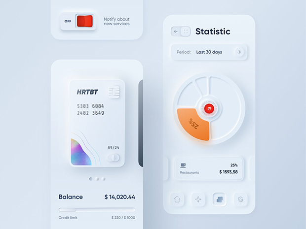
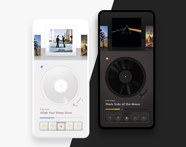
It seems some of the design community embraced the trend and has started to apply the style everywhere. Here are a few samples that I personally love.


I decided to take a stab at trying out the design myself, and to my surprise, it’s relatively easy to create. Here are a few steps you can follow to wrap your head around how it works.
Step 1 – Create an artboard/frame and choose a canvas color. My frame is sized for the iPhone 11 Pro (375×812 pixels), and the color is #EEEEEE.

Step 2 – Add a rectangle shape sized at 250×250 pixels. It should be the same color as the artboard/frame background #EEEEEE. I have rounded corners at a 20 radius. Keep in mind, this style works best with rounded edges and objects. Hard edges don’t work for Newmorphism.
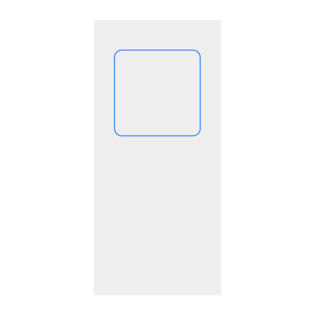
Step 3 – Add a drop-shadow effect with a blur of 9, and the x and y coordinates should also be 9. The color of the drop-shadow should be #000000 at 5% opacity.

Step 4 – Duplicate that drop-shadow style (or shape if you can’t have two or more drop-shadows on one shape). Now adjust the drop-shadow styles to be the inverse. The blur should be -9, and the x and y coordinates should also be -9. The color of the drop-shadow should be #FFFFFF at 40% opacity.

Voilà! You’re now a Neumorphism aficionado. The styles can also be applied to other shapes. I’ve applied it to a circle shape.

It also looks terrific in dark-mode.
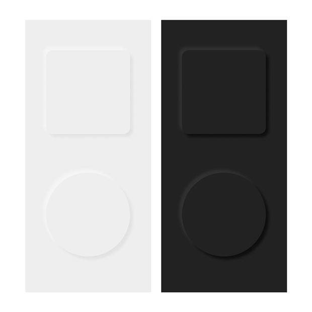
I’ve duplicated the artboard and kept the same shapes but adjusted the colors. The dark color is #222222. The dark drop-shadow color is #000000 at 60% opacity. The dark drop-shadow color is #454545 at 45% opacity.
For a detailed and visual walkthrough, check out the YouTube from DesignCourse.
While the trend feels modern and new, there has also been a lot of concern about it violating some accessibility rules. In particular, the shadows are barely visible for those who have a sight impediment. The low contrast makes it a bit harder for everyone to appreciate the style.
Then there’s the development issue and how it gets rendered in the browser. With more specific box-shadow attributes, it could start to complicate things, and we could see the style completely dropped in older browsers and devices that don’t support the CSS for it.
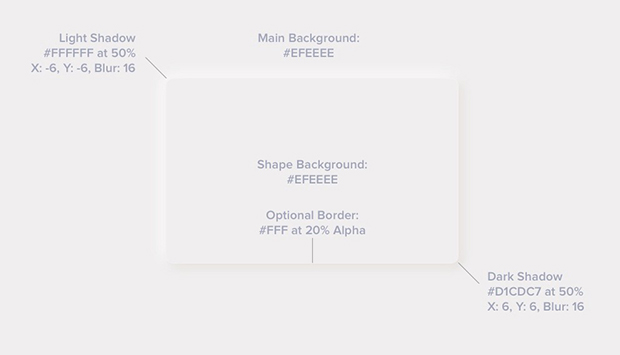
This image is from UX Design Collective, and it demonstrates the CSS values for style.
Let’s see how 2020 progresses to see how far the trend will go.