Tidying Up Your Design
Netflix’s Tidying Up with Marie Kondo has had a tremendous impact on American households for the better. I decided to apply these principles to my home, and I immediately saw the positive effects unfold. It started with thanking the items that I let go. Then for the kept items (referred to as the items that “spark joy”), I felt a deep appreciation for having them in my life. Yes, I’m keeping that Burning Man faux-fur coat with sewn-in lights.
With more clarity for the things I kept in my life, I wondered if this same concept could be applied to design.
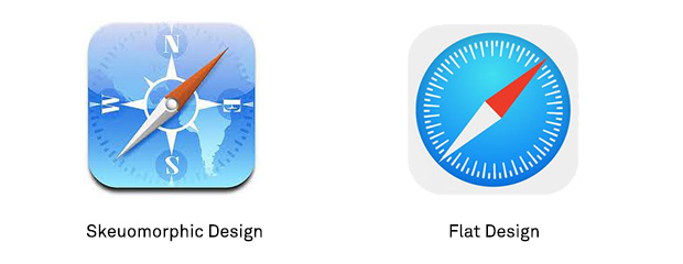
Tidying up design has been a trend that has already taken flight over the past years. For example, top tech giants like Apple and Google jumped on the Flat Design band-wagon and ditched superfluous 3D gradients and inner-shadows in app icons and UI components like buttons and input fields. It was a turning point from elements looking skeuomorphic to flat design with only the essential styles needed.
Letting go of skeuomorphic styles is just the beginning. We can also start letting go of the unnecessary elements and styles in our designs, and get clear of what’s necessary.
Tidying up your design will take more than simply asking if it “sparks joy”. Here are some quick prompts you can keep in mind when going through the tidying process:
- Is it redundant?
- Is it distracting?
- Is it inessential?
Let’s explore each of these cues in detail!
Is it redundant?
It might seem obvious to get rid of, but redundancy is abundant in design. We tend to want to have all the information on a layout, but you can make it easier on the eyes if you abandon elements that repeat for no good reason.
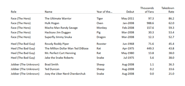
Merging the left-most table content can make all the difference in processing the table information at a glance.
Redundancy can also take the form of being already implied. If you have two things that say the same thing, feel free to let go of one of them.
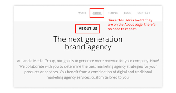
If it’s clear to your users what page they are on, then there’s no need to have redundant language in the title. This can be a missed opportunity.
Is it distracting?
There’s nothing more harmful to design than it getting hijacked by one or more distracting elements. Everything on the layout should have a specific goal that keeps the user focused on the task at hand. Adding multiple tasks or having disruptive elements compete for the user’s attention will only make it difficult for them.

When elements are competing for your attention, the user can lose sight of what they came here for in the first place.
Unless the color or images are a part of the brand as a whole, designers should be cautious about using loud and obnoxious elements. Not only do they distract, but you can lose all credibility with users.
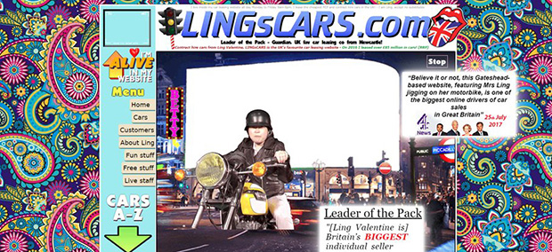
Oh Ling! Crazy imagery and colors can bewilder your users for the worse.
Is it inessential?
The most critical part of tidying up your design is the removal of all that is inessential. A rule of thumb is to remove the element or style and see if that changes the intention. If its intent remains true without it, then its probably inessential, and you should consider hitting that delete button.
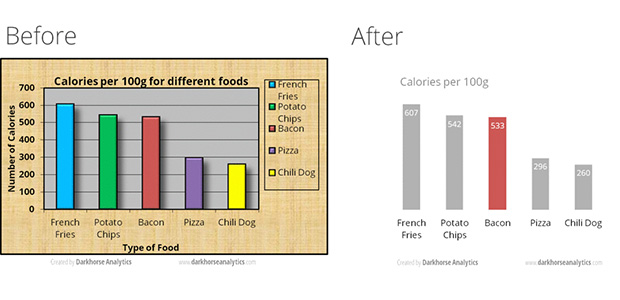
Removing unnecessary style elements in a data chart can make it easier to understand the information. The image is from Dark Horse Analytics.
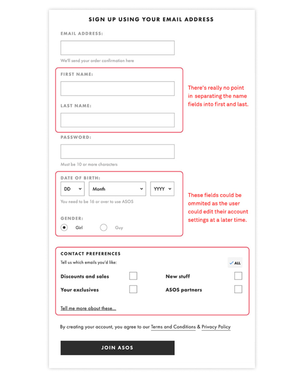 Losing some of the form elements during onboarding creates fewer points of friction and gets users in the app. The image is from 11 Form Design Guidelines.
When you tidy up your design, everything will start to have absolute focus and purpose. It will be stripped down to the essential elements and styles, and your users will appreciate what’s left on the page.
For all the elements you’ve let go, feel free to bid them goodbye if you want. I’m sure Marie Kondo would nod with approval.